How to Build a Responsive Website: Step-by-Step Tutorial
In today’s web-driven world, creating a responsive website is essential. Responsive design makes your site adapt and look great on any device — phones, tablets, laptops, and large desktop monitors — so users get a seamless experience no matter how they visit. This guide explains the concepts, planning, techniques, testing and ongoing maintenance you need to build a professional responsive site, all in plain information (no code included).
What “Responsive Design” Means
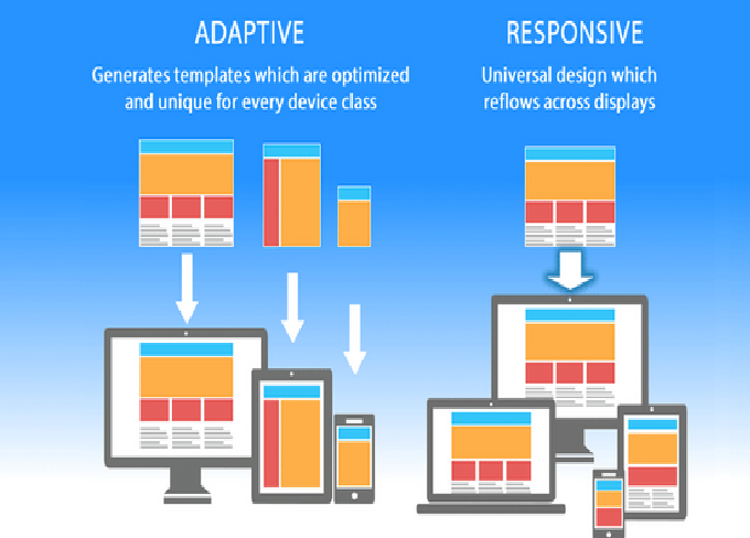
Responsive design is an approach that makes web pages adjust automatically to different screen sizes and device capabilities. Instead of designing separate sites for mobile and desktop, a responsive site uses flexible layouts, fluid images, and rules that change presentation depending on the device. The primary goal is usability: easy reading, straightforward navigation and no awkward zooming or horizontal scrolling.
Key principles:
-
Fluid grids: Layouts sized using relative units so elements scale proportionally.
-
Flexible media: Images and multimedia that resize and maintain aspect ratio.
-
Breakpoints / media rules: Different styling or layout adjustments applied at certain screen widths to optimize presentation.
Why Responsive Design Matters
-
Better user experience — Visitors can read and navigate comfortably, which increases engagement and conversions.
-
SEO advantages — Search engines favor mobile-friendly sites; responsiveness supports mobile-first indexing.
-
Cost efficiency — Maintaining one responsive site is easier and cheaper than separate mobile and desktop versions.
-
Future-proofing — New device sizes and form factors appear frequently; responsive design helps your site remain adaptable.
Planning Your Responsive Website
Good results start with planning.
-
Define goals and audience: Determine the site’s purpose, primary users, and the most important actions you want visitors to take.
-
Content inventory: List pages, components (navigation, forms, galleries), and priority content for mobile versus desktop.
-
Wireframes and layout sketches: Sketch structure for multiple screen sizes — narrow (phone), medium (tablet), and wide (desktop). Focus on content hierarchy: what appears first on small screens, what can be collapsed or hidden, and how navigation will behave.
-
Decide approach: Choose whether to build from scratch using core technologies or use a framework or CMS. Consider factors like development time, customization needs, and team skills.
Structure and Content Strategy
Responsive design isn’t only about visuals — content strategy matters.
-
Prioritize content: On small screens, present the most important information first. Trim or reorganize less critical sections.
-
Chunk information: Use short paragraphs, headings, and clear calls to action. Scannability is vital for mobile users.
-
Use progressive disclosure: Hide secondary details behind expandable sections or separate pages to keep primary screens uncluttered.
-
Design for touch: Ensure interactive elements are large enough and spaced adequately to avoid accidental taps.
Layout Techniques (Conceptual)
There are three conceptual tools that make layouts flexible:
-
Relative units: Instead of fixed pixels, use proportional measurements so elements scale with the screen.
-
Flexible containers: Allow blocks to grow, shrink or stack depending on available width.
-
Breakpoints: Define logical screen widths where the layout needs to change. Common examples are narrow (phones), medium (tablets), and wide (desktops), but you should base breakpoints on your layout needs, not device names.
Use these tools together: fluid containers with thoughtfully chosen breakpoints let content reflow naturally across devices.
Images and Media
Media must adapt as screens change.
-
Responsive images: Use appropriately sized images for different screens so you don’t send oversized files to small devices.
-
Maintain aspect ratio: Ensure images scale without distortion.
-
Lazy loading: Load images and media progressively to reduce initial page load times, especially on mobile networks.
-
Consider formats: Modern image formats and compression reduce file sizes and improve load speed.
Navigation Patterns
Navigation often dictates the usability of a responsive site.
-
Adaptive navigation: On wide screens, use a horizontal navigation bar. On narrow screens, collapse navigation into a compact format (e.g., a toggle/hamburger menu) that reveals options when needed.
-
Persistent important links: Keep top priority navigation items easy to access on small screens.
-
Breadcrumbs and secondary navigation: Use them to help users understand where they are on the site without cluttering the main screen.
Performance Optimization
Responsiveness also means fast performance.
-
Optimize assets: Compress images and minimize CSS and JavaScript to reduce file size.
-
Reduce HTTP requests: Combine or defer assets where practical, and trim unnecessary libraries.
-
Caching: Use browser caching and server-side caching to speed repeat visits.
-
Content Delivery Network (CDN): Serve static assets via a CDN to reduce latency for users far from your server.
-
Mobile network considerations: Test how your site behaves on slower networks and optimize accordingly.
Accessibility and Inclusive Design
A responsive site should be usable by everyone.
-
Semantic structure: Use clear headings and logical document structure to help screen readers and assistive tech.
-
Alt text and labels: Provide alternative descriptions for images and labels for controls.
-
Color contrast and legibility: Ensure text is readable in different lighting and contrast environments.
-
Keyboard navigation: Ensure interactive elements can be accessed and controlled via keyboard where applicable.
-
Test with assistive tools: Use screen readers and accessibility checkers to catch issues before launch.
Frameworks and Tools (Informational)
If you want to speed development or get consistency, consider frameworks and tools. Options include utility-first toolkits, component libraries, and responsive grid systems. Each offers different tradeoffs between speed, opinionation and customization. When evaluating frameworks, consider:
-
How much default styling you’ll get versus how much you must override.
-
The learning curve and documentation quality.
-
File size and performance impact.
-
Community support and ecosystem.
Testing Strategy
Testing across devices and scenarios is crucial.
-
Browser developer tools: Simulate various screen sizes and device behaviors to spot layout issues quickly.
-
Real devices: Test on actual phones and tablets to check touch interactions, font sizes, and rendering differences.
-
Orientation: Test in both portrait and landscape modes.
-
Network conditions: Test on slow and fast networks to check loading behavior.
-
Cross-browser testing: Verify rendering on major browsers and versions your audience uses.
-
Usability testing: Observe real users completing tasks to uncover hidden usability problems.
SEO and Content Considerations
Responsive design supports good SEO, but you still need to optimize content.
-
Mobile-friendly content: Ensure headings, meta data, and content structure are optimized for search.
-
Page speed: Fast pages rank better; performance optimizations directly affect SEO.
-
Structured data: Use schema where appropriate to help search engines understand your content.
-
Avoid intrusive interstitials: Overly disruptive popups on mobile can harm ranking and frustrate users.
Common Mistakes to Avoid
-
Fixed layout assumptions: Don’t design only for a single screen width — elements should be flexible.
-
Overcomplexity on mobile: Don’t cram desktop features into small screens; simplify and prioritize.
-
Neglecting performance: Large assets or heavy scripts slow down mobile users dramatically.
-
Relying only on simulators: Emulators are helpful but real device testing often reveals issues simulators miss.
-
Ignoring accessibility: Responsive layouts must still be accessible to be effective.
Deployment and Maintenance
After launch, ongoing care keeps the site relevant and functional.
-
Monitor analytics: Look for device breakdowns, page speeds, and user dropoff points to guide improvements.
-
Update content and assets: Periodically refresh images, compress new assets, and revisit performance.
-
Test new device sizes: As new phones and form factors appear, spot-check critical pages.
-
Security and dependencies: Keep platform, libraries, and plugins updated to avoid vulnerabilities that could impact users.
Final Checklist (Before Launch)
Make sure:
-
Layout adapts cleanly at target breakpoints.
-
Navigation works and is discoverable on all devices.
-
Images and media scale properly and load efficiently.
-
Page speed is acceptable on mobile networks.
-
Accessibility basics are implemented (alt text, labels, semantic structure).
-
Content hierarchy prioritizes important information for mobile users.
Conclusion
Building a responsive website is less about specific code snippets and more about understanding principles: fluid layouts, flexible media, content prioritization and performance. With good planning, thorough testing on real devices, and attention to accessibility and speed, you can deliver a website that delights users on every screen. Responsive design is an investment in user satisfaction and long-term reach — the payoff is better engagement, improved SEO, and simpler maintenance.


Post Comment